Overview
During my time working with the very talented marketing team at Clio, I was given a project that would turn out to be one of the biggest learning experiences for me as a designer and developer. I was asked to create an interactive web-based infographic to display the data collected from their annual Apple In Law Offices survey for social sharing purposes.
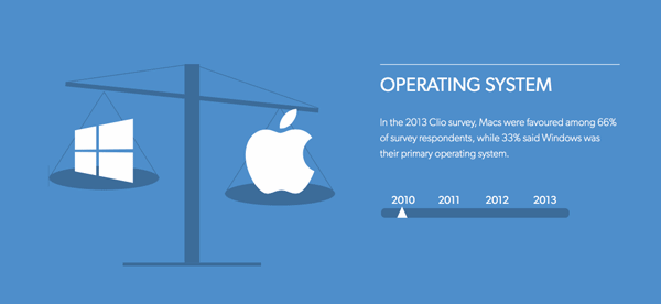
The Apple In Law Offices survey has been an annual survey of existing Clio users collected from 2010 onward that was created to gage the growing popularity of Apple products, in comparison to its competitors, in law offices.

The Process
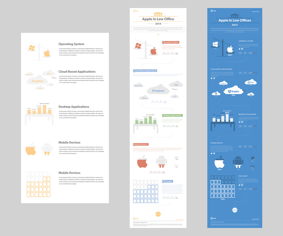
I started the project by first diving into the 4 years of survey results in search of good clean data and any trends that small firm lawyers would find interesting. I found that out of approximately 10 survey questions, many only had a few respondents therefore the data was not accurate enough to showcase. Other questions were simply not relevant. I narrowed the data down to 5 main points that were not only interesting, but had enough respondents to ensure accuracy.

I made sure to sketch out any ideas that came to mind, and wrote down quick notes to help group and organize the data that was floating around my head at this point.
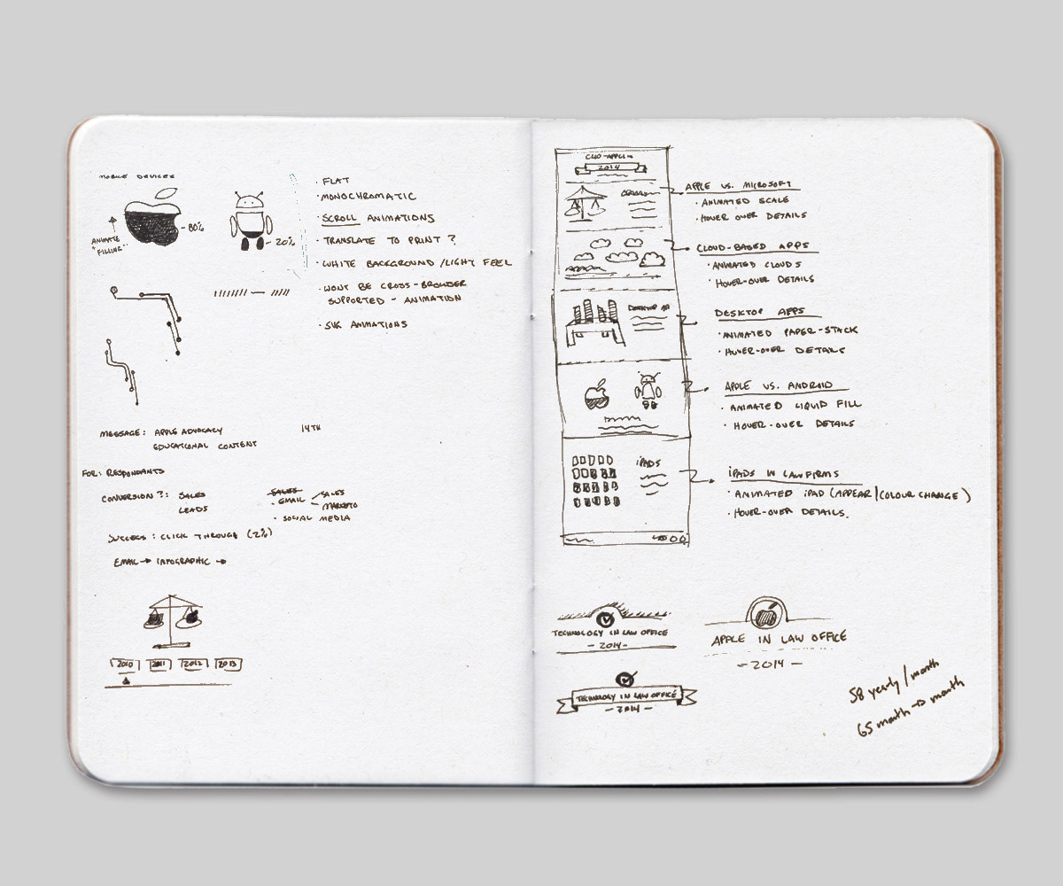
I was also researching some of the many ways to display animations/interactions in web formats. Animated .svg’s were a relatively new technology that I found to be promising. Vector format graphics not only look nice on retina screens, but have an extremely low file size. Knowing the final format would be svg graphics, I began the design phase in illustrator.
The Design
One of the many things I loved about working at Clio, was their large and extremely talented design team. A total of 10 designers all lead by one very clever Creative Director allowed for endless opportunities to gain feedback and learn from each other. Once the first draft of the infographic was completed (no colour yet), I was able to schedule a design critique that would allow me to gain valuable feedback from my peers. Over the iteration process, I had 4 design critiques resulting in some small simplification of the design and myself settling on a final colour scheme.
The Challenges
With some extended research into svg animation, I discovered a JavaScript library, Snap SVG, that can trigger animations of .svg graphics. This was not as simple as I thought it would be however. At the time, svg animations were relatively new, there was very little online support for the technology. Because of this, and the fact that I was new to JavaScript, this would mean a lot of trial and error… and I mean A LOT!
I’m not going to lie, there were times I felt I was in way over my head, and started thinking that there was no way I would make deadline. I refused to quit however. After a few long nights, the first animation was working as it should. I believe there were numerous fist pumps that night. Once I got one working, the rest would just fall into place.
Another challenge was the facebook and twitter share buttons. I wanted to each individual section of the infographic to be sharable on its own as well as the ability to share the entire webpage. This would take some more online research to find the proper codes and a lot of testing to get it functioning properly.
The Moment of Truth
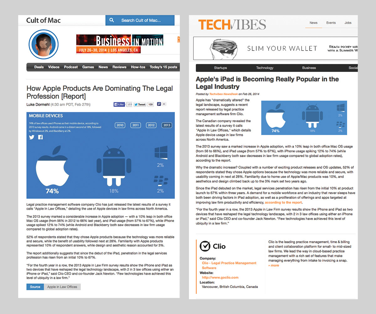
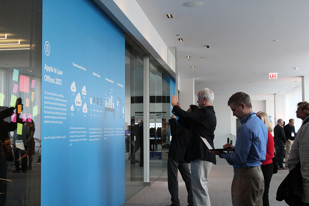
Once the finalized infographic was completed, fully tested, and pushed live, it was time for the rest of the marketing department to do their thing and get it noticed. The webpage made its way to be featured on Cult of Mac and TechVibes… something I thought was pretty cool and made the entire process so much more worth it.